So I decided, with some recommendation from my tutors, to take a load of photographs of samples that i had previously done. I had wax on tulle, some paper with pleats, and different knitted materials. After I took 79 pictures, I picked out my favourites and edited them in Photoshop. I contrasted, deepened, and cropped them.
I like how this one turned out because the orange, red and blue are so vivid and powerful.
This is one of my favourites because of the shape of the fold with the plaster on it and the clarity of the lines in the picture came out well.
The folds in the paper came out really nicely when the light hit it at a certain angle.
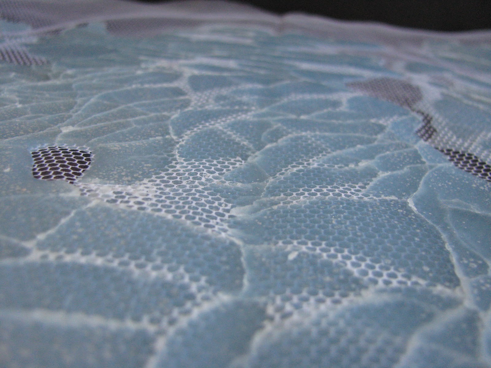
I love the ridge between the two piece of wax and how the tulle curves up between them
The little white dots on top of the wax formed shortly after the wax had cooled down.
The knitted wire was hard enough to do but came out really well in the end.
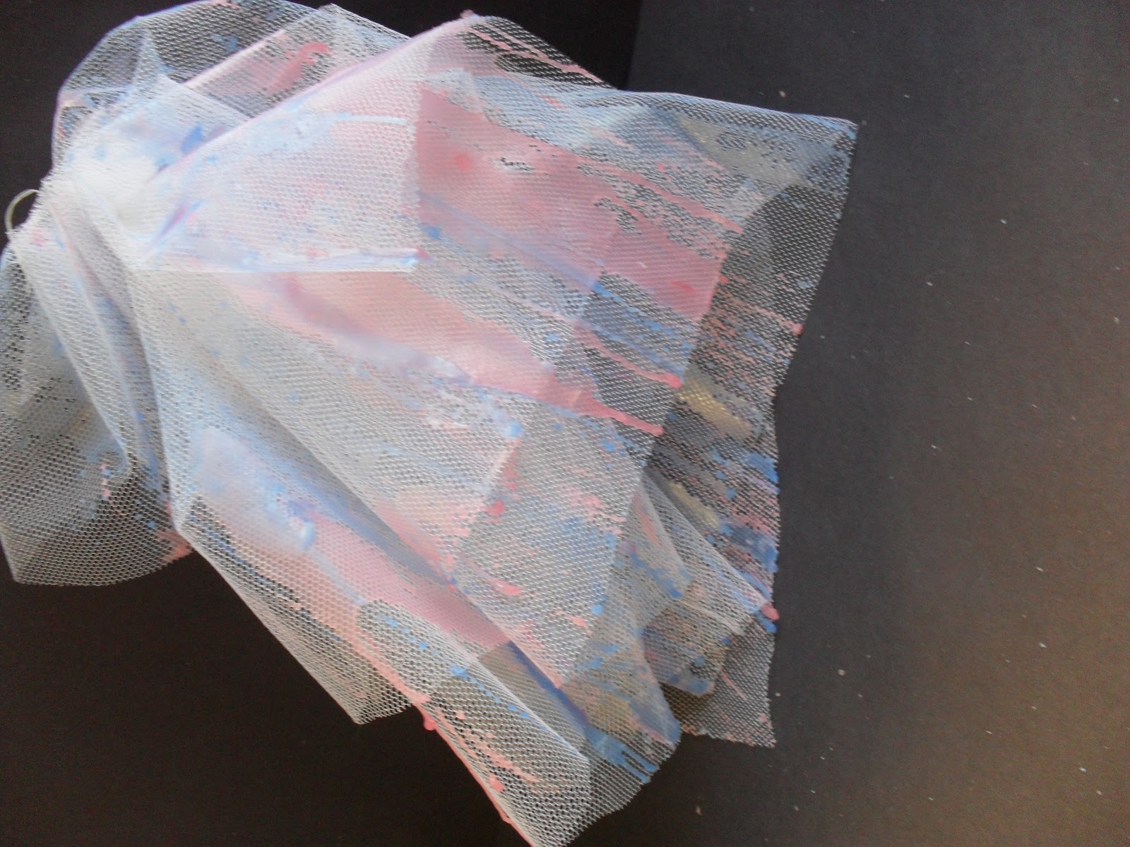
This photo is my favourite one, I love the pink drop in the centre and the grid of the tulle underneath. It came out so clearly, when I brought it into Photoshop to edit it, all I had to do was deepen and contrast the colour which mad the pink come out even more. I did the same with the photographs below.