So after the thumbnail sketches I progressed onto ideas and drawing them out in different ways. Firstly I wrote the ideas down on a page and then using the images I collected while researching, and my thumbnails, I drew them out on A3.
Its time for some drawing. I felt it was a good idea to make a new mind map just to make it easier for myself. We also did thumbnail sketches to get the images from our heads out onto paper. This instigated the production of ideas.
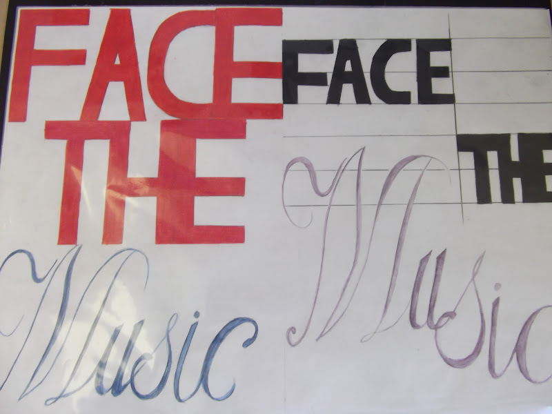
I tried out some of my own concoctions with type at the beginning and then found some type research to go from there The good thing about it was it was easy to mash my ideas and the type research together to produce even more ideas.
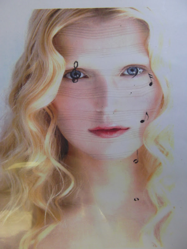
It's the last elective so we're nearly there. The first part of our brief is Typography which was strictly no images only type. We all hae metaphor's that we must portray through type in the first week and illustration in the second week.
I decided to do one last monoprint. It was a really simple one but I like how it turned out. The red was kind of a reflection of the love and affection that the figures are showing through the embrace.
Here it is.
We had a little mini project to do with clutter, so I just walked
around my house and sure enough, there was some there. We could take a
max of 4 photos and no cropping or editing was allowed.
So I chose this on below because I liked the items in the picture.
I decided that I wanted to do a few different ones and change up the colour of each of them. I really liked how they turned out :)
Here they are and I really love them. I did them in a variety of different colours, cold and warm, and I found that the cold colours were sharper but the warm colours reflected the affection of the embrace. Either way, I think they came out really well and I'm really happy with them.
I also did one last monoprint, just to see how it would turn out and it wasn't as good as I wanted it to be but making mistakes is important so I'll not make those ones again.